TL;DR: Bad animation is bad. Good animation is necessary for good communication, reducing the cognitive load on users, giving a natural feel to your app and, in general, improving the user experience.
It’s almost 2019. The web has changed over the years. Responsive design is the norm. You know a large portion of your users is going to be using mobile devices. Proper User Experience design is not only respected but expected. More focus is being given to accessibility and its importance. Browsers are constantly improving and Internet Explorer is almost a relic, left behind in history. In times where people are so used to the natural motions and gestures of smartphones, we cannot afford to have our websites look dated. Yet developers often try to stay away from animations; some even cringe by its name, worrying about the performance hits and increased development time. Even when some animation is implemented, it is an afterthought and that can be seen in the results.

Even as users, animation can seem annoying. Pop-up ads are probably the most hated experience on the web, no matter how beautifully they’re animated. And animation gets the blame. Other common complaints are that it’s distracting, confusing and gratuitous. I think the above examples hits all those marks. But here’s the kicker. Like most things, there’s a wrong way and a right way to do animation. And if you hate animation, you might be doing it wrong. Here’s the above list of complaints again, but this time with reasons: distracting, the wrong thing was animated taking the user’s attention away from what’s important; confusing, too many things animated, and the user is not sure what to pay attention to; gratuitous, animating something just for the sake of it, ignoring how the user might feel.
Humans are evolutionarily trained to detect movements. An animated element automatically catches the eye of a user. So when its done wrong, it is blatantly obvious. It’s like taking an ugly painting and framing it for all to see. However, on the flip side, if the animation is done right, it can be a huge boon to the user experience.
When we sit down an create a website, our primary job is to communicate something to our users. Using animation is a great way to do that. Consumers are four times as likely to watch a video about a product, rather than read about it (emarketer). One reason for this can be that videos are more engaging than text. Animations play a similar role. And since animations can instantly grab the user’s attention, we can point her to what’s important in a natural way. Something as simple as animating a colour change gives our eyes even more opportunity to notice the change, as it draws it out over a longer period of time. Further, animation can be used to tell a story or be part of your brand.

In the real world, things don’t pop in and out of existence. Every time a user visits a website, she unconsciously makes a mental map of it, noting where possible things of interest are. That’s why websites start to look the same. Without ever having visited a website, you know that clicking on its logo takes you back to the home page, or that the ‘Contact Us’ link is probably at the bottom of the page. However, sudden changes in the layout increase the cognitive load on the users and make applications much less intuitive since the user now has to re-map the entire page. That’s where animation comes in. It provides an easy transition from one layout to another. See for yourself. In which of the two following clips are the blue circles easy to keep track of?


Did you know that the reason baggage claim is so far from the gates in airports is so that airline customers don’t feel like they’re waiting as long for their bags? Instead of spending a lot more resources on actually improving their performance, airports simply reduced the perceived load time. Animations can do the same thing. Services calls are inevitably slow. At some point, your users will have to wait for your amazing data to load. Something as simple as throwing a custom progress indicator (ideally something better than a spinner) in there can immensely improve their experience. It shows that you care for them. Smashing magazine has an amazing article about progress indicators.
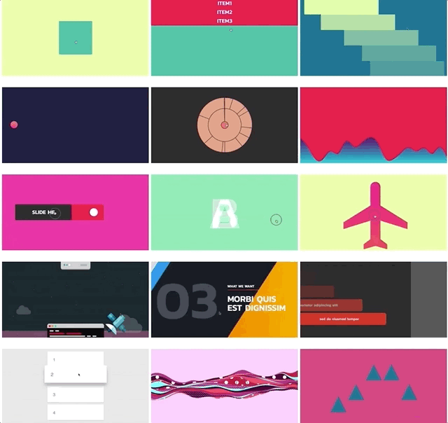
More than anything, animations just feel natural. I spend the first half of this post bashing animation, but really, I was only bashing bad animation. Good animation is beautiful, feels right and engages the user. It should ideally be used sparingly and never get the way of the user. It’s very unlikely that a purely cosmetic animation effect will make for a better product. Animation has to be an integral part of the design process. There’s never been a better time to bring animation into your web design process. Browsers are getting better, devices are becoming more powerful, and we are getting better tools to help create animation. Just see what all you can do with one library

So go an animate, and create something memorable that keeps users coming back for more.


Leave a comment